
Trend #1: Two Sentences. Ultimate Tagline.
If your product/service/brand/business is not currently being represented by two generic sentences, perhaps your product/service/brand/business just sucks. All the other guys are doing it! Since I've been spending more and more time in front of the TV lately (thanks to the Food Network and So You Think You Can Dance), I've been noticing a ton of these: The two-sentence slogan. I know a tagline is meant to be short and to-the-point, but they're starting to sound exactly the same. Let's take a peek.
Target: "Expect More. Pay Less." (Expect more what? Magic? Dog shit? I'm confused.)
Wal-Mart: "Save Money. Live Better." (Better......kind of. But upon review, a LOT like the first one. Smooth.)
Nutrisystem: "Lose Weight. Live Better." (lol. see above.)
Home Depot: "You Can Do It. We Can Help."
Papa Johns: "Better Ingredients. Better Pizza."
The last two aren't completely awful, but you get the idea. Wherever this two-sentence phenomenon came from, it's like the plague. And speaking of the plague:
Trend #2: Bleeding "not your momma's typeface" Cowboys.
If your product/service/brand/business cannot incorporate the glory of dafont.com's Bleeding Cowboys, again...you're going to fail (if you haven't failed already). MTV's doing it! So are music acts. In all seriousness, though, my belief is that this font is on the fast track to becoming the new Papyrus. I will shun it forever. It's become far too overused, instantly recognizable, and regardless of its potential "kind of okay" uses (rodeo posters, your kid brother's garage band promo stickers, printed on poop-scoop bags), I still think there is a multitude of alternatives that will do the job...and do the job more effectively. Despite my thoughts, it's spread like wildfire. See the following.
Chris Daughtry's new album cover.
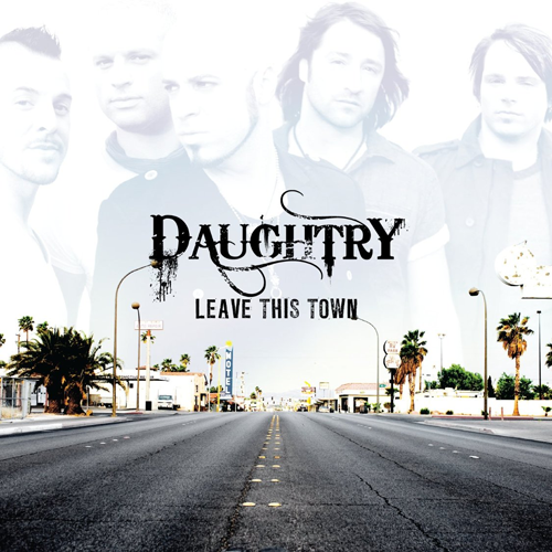 God. It's just so rugged and irresistible!
The new MTV show, "Is She Really Going Out with Him?"

I think this usage could be warranted, due to the fact that this show is not to be taken seriously. It still gets me fired up at the fact that a popular network is spreading this sickness to the masses. However, this one really upsets me:

A design blog, guys? You couldn't hand-generate something that effectively communicates your message? The message I hear is, "I don't know what I'm doing...I just know that this will be a big hit with the kiddos. They dig that new 'grunge' thing, I hear."
Okay, so the two-sentence taglines I can kind of wrap my head around. But do some damn research, man. Target and Wal-Mart are similar, yes, but their pitches shouldn't sound the same. As for shitty fonts like the B.C., whatever happened to making your own designs instead of downloading them?
Creativity shouldn't be dead, people. And if you've got a powerhouse name behind you (like, oh, I don't know, a RECORD LABEL), why not step outside the box a little, for all our sakes. We designers want to think there's still some innovation left in the world, and we don't like being left with the sour "I've seen that before/could have done it better/wish I got paid what he did/have no faith in humanity" taste in our mouths.

3 comments:
IHOP. Come hungry, leave happy.
YES!
Post a Comment