
Steve Carell is a stick of gum!
Jeremy Piven is tequila!
Zach Braff is water!
http://www.purwater.com/voiceofwater/
Chris Parnell is a huge talking glove!
(Denis Leary is also a truck, but I like the commercials more than I like him).
What's with all the selling out, fellas?
Don't worry...I still love you. Now if you'll excuse me, I need to take this Cuervo shot and finish making my Hamburger Helper.
Tuesday, March 24, 2009
Friday, March 20, 2009
If you want to feel like a kid again...
Check this out! I remember being fascinated with the Jurassic Park movies when I was younger (and even today), but this right here fills me with more curiosity and childlike wonder than my brain can process. Ahhh, I love it!
Here's the full story and a longer video from BBC.
Here's the full story and a longer video from BBC.
Wednesday, March 18, 2009
THE LOGO CONSPIRACY
Either there's something in the water, aliens who like to feast on tasty little designer brains, or millions and millions of dollars being thrown at the ultimate April Fool's prank.
Rebranding is happening everywhere it seems, but most of it is taking a thousand paces backward for both design and the clients involved. Tropicana dropped a huge bomb when they swapped out their classic straw-in-the-orange for a big glass of OJ: sales dropped because their faithful customers couldn't find the Tropicana. All they saw was a shelf full of generic store brand juice. Both designers and non-designers complained, and I can't blame them, either.
Off the top of my head, I can't think of any company that's made a powerful leap forward with rebranding recently. Coca-Cola's simplification was a pretty good one, but that's about all I got. Anybody who has an example of an "ah-ha" rebrand should let me know, because I'm beginning to lose faith over here.
8 Rules of the Rebrand:
1. Friendly company name + Generic sans serif = Irony
 Blimpie's old logo wasn't the greatest thing in the world, I will say that. But the name is Blimpie, for God's sake. It's going to sound fun no matter what you do to it, so you might as well embrace that fact. Instead, the sans-serif trend was put into motion and killed the whole vibe. Do not want.
2. A pointless swoosh does not make a (good) difference.
 Nothing is different from the old logo, with the exception of the color and a boomerang (?). The swoosh serves no purpose, aesthetically or conceptually. Unless you're Nike or have a damn good reason to swooshify something, don't.
3. Live trace is never the answer.
 The most confusing thing about this rebrand is the fact that it went in the opposite direction of the trend. "Simplify, simplify, simplify? No. We gave our in-house designer the week off and gave Jimmy access to the live-trace button. And now we have a new logo!" Sick. And won't this be more difficult to implement on signage? (Thanks to Stephen for bringing this one to my attention)
4. Communicate the message of your company.
 Neither animal, nor planet. I have tried to see an abstracted bird's beak in the side-ways "M," but if that was an intentional move, it wasn't made obvious enough. Trendy (kind of?) but could have made use of a dynamic icon rather than this weird arrangement of type.
5. Don't make it look like Hell.
 Literally. A swirling, spiraling pit to Hell.
6. There's nothing wrong with a classic.
 When this one was posted on Brand New's website, one of the commenters posed a brilliant question: "Why does the smile have a herpes sore?"
If you want to make it more friendly, Kraft, round the edges some more. Bingo. This went from recognizable corporate brand to an awkward smirk. With herpes, I guess.
7. Never let your friend's cousin's high-school-freshman daughter design your logo.
 I'm still trying to understand this. Just...follow the damn rule. My eyes hurt.
8. If it ain't broke, don't fix it.
 Please.
Sunday, March 15, 2009
Imaginary fame, FTW
I've recently been fantasizing about what my life would be like if it involved more music and fame and less art. This has consisted of me listening to a lot of hip-hop/techno/other funky nonsense and "break dancing" regularly when nobody's watching. My moves got so intense the other day, I actually ripped a hole in my PJs. No lie.
Because I'm basically famous in my mind, I decided to recruit my high-profile posse. It goes as follows:
Zach Galifianakis (as Kanye West)
I need a guy who can bring both the laughs and the rhymes. Clearly, The Nakis delivers. He's not afraid to make an ass of himself in public, which means he would be hilarious to watch while simultaneously making me look awesome. I would be the straight man next to him. The Abbott, if you will.
(Kanye himself was originally going to make this list, but his fashion sense outshines my own. Sometimes.)
Chef Gordon Ramsay
I don't need an entourage of 7-feet-tall security guards to keep things under control. This guy can handle anything, 'cause he's British and likes to cuss a lot. Plus, he can probably make a gourmet meal out of vending machine food, so that's nice. He'd be like my MacGyver, but better. *Will be replaced with the real MacGyver after calling me filthy names in public.
Pam Beasley
Obviously, I need a celebrity BFF. I don't care if she's a made-up character, she's definitely necessary. She likes artsy stuff and would totally keep my things organized and answer my cell phone when I'm too busy signing autographs. We also share the same level of fashion savvy, so she won't judge me when I refuse to shop for new clothes (unless it's online).
Justin Timberlake
What doesn't this man do? He's responsible for performing/mixing/producing all the CDs that go in my ride. JT will also perform incredible dance solos when I need a diversion in awkward situations. For example: "What's that, officer? I was speeding?" *Justin Timberlake proceeds to distract, I drive away unscathed by the law.*
Ben Franklin, duh
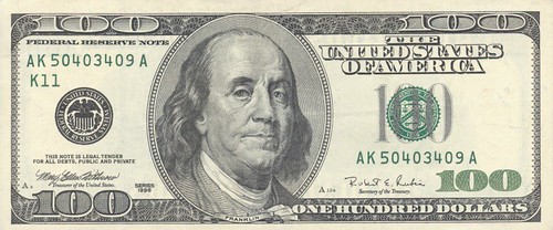
For all my spending needs.
Being famous is my imagination is awesome. I get all these great celebrity buddies, PLUS I get to keep my real friends, too. Who could compete with that?
Because I'm basically famous in my mind, I decided to recruit my high-profile posse. It goes as follows:
Zach Galifianakis (as Kanye West)
I need a guy who can bring both the laughs and the rhymes. Clearly, The Nakis delivers. He's not afraid to make an ass of himself in public, which means he would be hilarious to watch while simultaneously making me look awesome. I would be the straight man next to him. The Abbott, if you will.
(Kanye himself was originally going to make this list, but his fashion sense outshines my own. Sometimes.)
Chef Gordon Ramsay
I don't need an entourage of 7-feet-tall security guards to keep things under control. This guy can handle anything, 'cause he's British and likes to cuss a lot. Plus, he can probably make a gourmet meal out of vending machine food, so that's nice. He'd be like my MacGyver, but better. *Will be replaced with the real MacGyver after calling me filthy names in public.
Pam Beasley
Obviously, I need a celebrity BFF. I don't care if she's a made-up character, she's definitely necessary. She likes artsy stuff and would totally keep my things organized and answer my cell phone when I'm too busy signing autographs. We also share the same level of fashion savvy, so she won't judge me when I refuse to shop for new clothes (unless it's online).
Justin Timberlake
What doesn't this man do? He's responsible for performing/mixing/producing all the CDs that go in my ride. JT will also perform incredible dance solos when I need a diversion in awkward situations. For example: "What's that, officer? I was speeding?" *Justin Timberlake proceeds to distract, I drive away unscathed by the law.*
Ben Franklin, duh
For all my spending needs.
Being famous is my imagination is awesome. I get all these great celebrity buddies, PLUS I get to keep my real friends, too. Who could compete with that?
Thursday, March 12, 2009
Two video posts in a row? Really?
Yes.
Please enjoy this music video from Raphael Saadiq. Why aren't there more videos like this? I wonder that every day.
Please enjoy this music video from Raphael Saadiq. Why aren't there more videos like this? I wonder that every day.
Monday, March 9, 2009
Flickermood 2.0
I thought the Pulp Fiction typography animation was one of the best out there, but this one takes the cake. There's something powerfully captivating about the words and visuals. It's not meant to be read, but experienced.
Flickermood 2.0 from Sebastian Lange on Vimeo.
Flickermood 2.0 from Sebastian Lange on Vimeo.
Sunday, March 8, 2009
Men of Senior Studio: Three Months of Sexy Calendar
Ladies! Do you need a man in your life who is sophisticated? Sensitive? A bad boy, perhaps?
Allow me to introduce you to some of the men of senior studio. Their passion for art alone will make you swoon, but these pictures are worth more than a thousand words.
 Look at that craftsmanship! Here, Stephen shows that he knows how to work with his hands while demonstrating some impressive exacto knife skills. Notice the mitten on the left hand...trend-setting AND practical. How's that for sophistication?
Allow me to introduce you to some of the men of senior studio. Their passion for art alone will make you swoon, but these pictures are worth more than a thousand words.
Mr. March: Stephen
 Look at that craftsmanship! Here, Stephen shows that he knows how to work with his hands while demonstrating some impressive exacto knife skills. Notice the mitten on the left hand...trend-setting AND practical. How's that for sophistication?
Mr. April: Nolan
 Caught in the act, Nolan is busy rounding the corners of some hand-made playing cards (gotta smooth out those edges!). If you look closely in the background, you'll notice that he has a great sense of humor. He also keeps in touch with his feminine side by using a pink corner-rounder...a girl couldn't ask for more.
 This bad boy is not afraid to get down to business. Ryan cuts to the chase and lets you know exactly what's on his mind, and he knows that you won't be able to resist it either. Let's not forget that he also loves painting, kittens and long walks on the beach. Every woman's dream!
The Men of Senior Studio: Three Months of Sexy calendar is available for a limited time only, so order now! Are you following me, camera guy?
 Caught in the act, Nolan is busy rounding the corners of some hand-made playing cards (gotta smooth out those edges!). If you look closely in the background, you'll notice that he has a great sense of humor. He also keeps in touch with his feminine side by using a pink corner-rounder...a girl couldn't ask for more.
Mr. May: Ryan
 This bad boy is not afraid to get down to business. Ryan cuts to the chase and lets you know exactly what's on his mind, and he knows that you won't be able to resist it either. Let's not forget that he also loves painting, kittens and long walks on the beach. Every woman's dream!
The Men of Senior Studio: Three Months of Sexy calendar is available for a limited time only, so order now! Are you following me, camera guy?
Wednesday, March 4, 2009
McFAIL
I would like to take a moment to acknowledge the fact that PETA's fake McDonald's website looks better than McDonald's actual website.
 McDonald's isn't really known for good things unless you're drunk-eating at 3AM or a fan of heart disease. This was pretty fantastic, though...I counted at least eight fonts on the Mickey D's site and lost track of the number of colors. The layout doesn't reflect their new branding system whatsoever and changes on almost every page, too. Click through it if you want a good laugh.
(Speaking of new branding, that grunge display text really says "chic" -- a nice homage to their new terra-cotta interiors and high-end coffee bevs)
Silly McDizzles. You've got a fugly little identity mess on your hands. You should probably hire me to fix it or something.
Fake


Real
 McDonald's isn't really known for good things unless you're drunk-eating at 3AM or a fan of heart disease. This was pretty fantastic, though...I counted at least eight fonts on the Mickey D's site and lost track of the number of colors. The layout doesn't reflect their new branding system whatsoever and changes on almost every page, too. Click through it if you want a good laugh.
(Speaking of new branding, that grunge display text really says "chic" -- a nice homage to their new terra-cotta interiors and high-end coffee bevs)
Silly McDizzles. You've got a fugly little identity mess on your hands. You should probably hire me to fix it or something.
Subscribe to:
Posts (Atom)
